
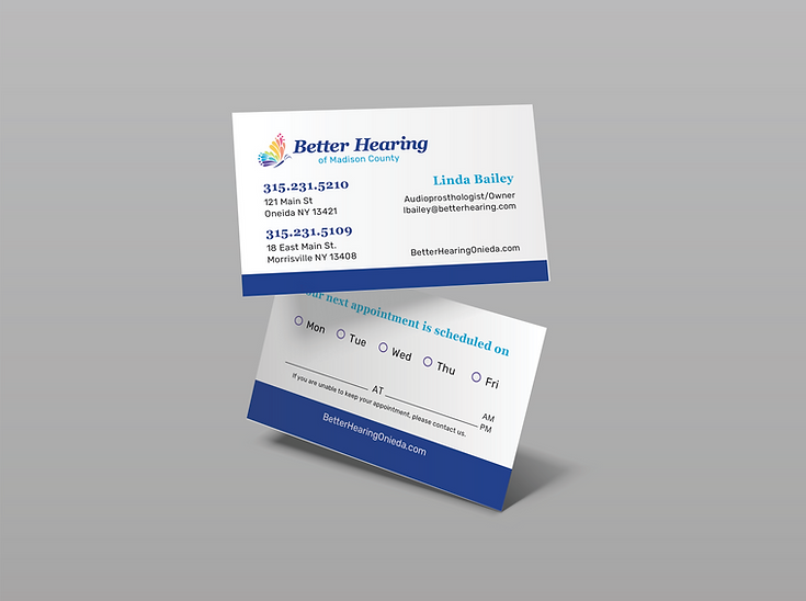
Better Hearing of Madison County is a family-owned audiology practice based in western New York state. The practice has been serving their community for several decades, and has always been a proud member of the community. Recently, they decided it was time for a branding refresh, as they had had their old logo since their opening. The aim of this rebrand was to keep the same joy and brightness as their old branding, but refresh and modernize it. It was important to keep the brand familiar to current patients while also attracting new ones with a fresh new feel. After several exploratory logos, this was the direction we ended up going in.

Georgia Bold
Primary Typeface
Rubik Bold
Secondary Typeface
Better Hearing of
Madison County
Logo Redesign and Branding
Old Logo
This is their old logo, as well as several of the original concepts we decided not to go with.

Logo Concept 1
Logo Concept 2

Part of the redesign for Better Hearing of Madison County was refreshing their website. I did not personally create the website, but did create the following web style guide for the web developer to use. Again, the goal of this style guide was to keep thing bright, friendly, and familiar, while incorporating a lot of color and lifestyle imagery.

Web Syle Guide

